Design Tokens
- 文章發表於
Introduction
In What is a Design System?, I mentioned my involvement in building a component library. Initially, my approach was quite straightforward—I matched the colors, font sizes, line heights, etc., from the design drafts one by one, almost copying and pasting them directly! During the first proofreading session with the designer, I proudly showcased various states of the components through Storybook, murmuring introductions like "This is the error state, this is the disabled style..." thinking to myself: I've created all states at once, how cool is that!
But just as I was feeling smug, the designer suddenly pointed out that the error state color of a certain component looked odd, it should be #FF0000, and asked me to double-check. I was stunned, my heart racing as I carefully examined it, and indeed, they caught me—I had mistyped the color code. At that moment, aside from shock, I was filled with admiration for the designer's keen eye.
After the proofreading, I shared the designer's superpower with my manager. Looking at me, the manager jokingly asked, "Do you have a problem with your eyes 😂?" I nodded, admitting that I have color weakness. He then laughed and said, "Jing, it's okay, software engineers have many different fields to explore; you don't necessarily have to do frontend!"
He then showed me that he had already defined all design tokens (like colors, fonts) in global CSS variables and reminded me: never write Hex codes directly again. He described the design system as a linguistic bridge between engineers and designers. With this layer of abstraction, we can avoid using specific values directly, ensuring design consistency and maintainability.
What are Design Tokens?
"Design tokens represent the small, repeated design decisions that make up a design system's visual style. Tokens replace static values, such as hexcodes for color, with self-explanatory names.
The simplest explanation of design tokens is that they transform visual elements (e.g., color - hexcode, size - pixel, ...) into labels through key-value pairs, providing designers and engineers with a common language.
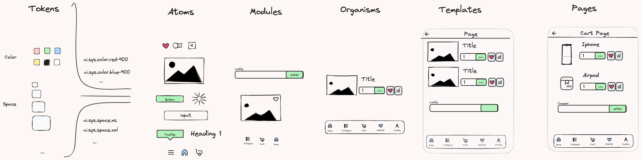
In What is a Design System?, I mentioned that building a component library can refer to the "Atomic Design" methodology. In this model, components are considered the most basic building blocks of the system—"atoms." Extending this logic, design tokens are like particles attached to atoms, giving them visual and stylistic attributes such as color, font, spacing, etc., ensuring each atom not only has functionality but also expresses a consistent design language.
Why Use Design Tokens?
As mentioned earlier, they serve as a common language between designers and engineers. Through them, both parties no longer need to communicate details using Hex codes or pixel alignment but can collaborate with unified semantic names, significantly reducing communication costs and improving consistency.
Additionally, design tokens are essentially a set of Single Source of Truth key-value pairs. When a product needs to maintain multiple platforms simultaneously (e.g., Web, iOS, and Android), and there's a need to change the brand color, without design tokens, each engineer might have to manually update the code and check for omissions or mistakes. With design tokens, once the designer modifies and releases new tokens, all platforms can automatically synchronize and update the relevant styles, greatly reducing communication and maintenance costs and lowering the risk of human error.
According to Google's Design System Guide - Material Design, the following scenarios are suitable for adopting design tokens:
- Planning to redesign an existing product or creating a new one
- The team's design system needs to be applied across multiple products or platforms (e.g., Web, iOS, Android)
- Aiming to maintain and update styles more easily, improving consistency and efficiency
Conversely, the following scenarios are less suitable for adopting design tokens:
- Existing application styles are hardcoded, and no significant changes are expected in 1-2 years
- The team or product has not yet established a design system, lacking a unified design language
How to Design Tokens?
As mentioned earlier, design tokens transform visual elements into semantic variable names through key-value pairs. So, in practice, how should we define the hierarchy and structure of these tokens?
Defining the Hierarchy of Design Tokens
Let's look at how several large design systems decompose and implement design tokens:
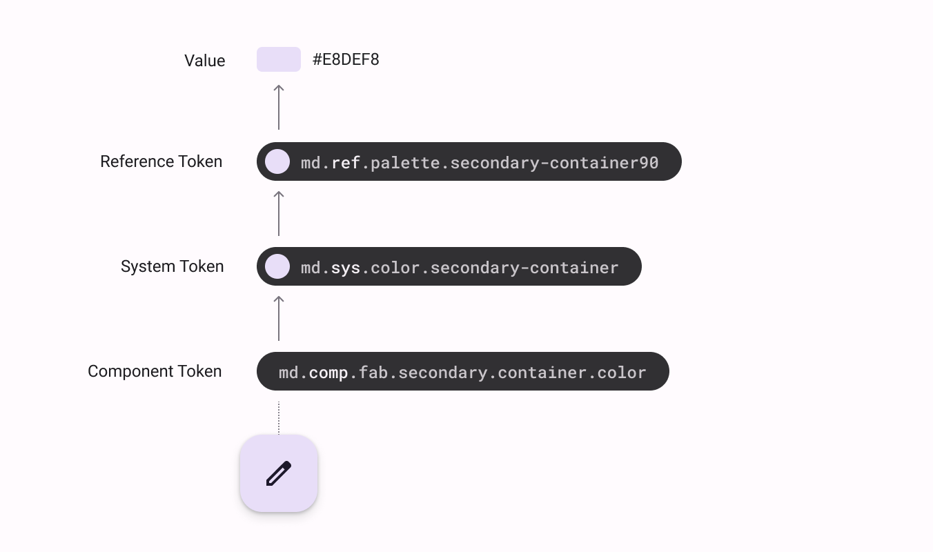
- Google - Material Design: They split design tokens into four levels: Value, Reference Token, System Token, Component Token
- Pinterest - Gestalt: Pinterest's design system also defines a four-layer structure: Value, Base Variable, Common, Component Token
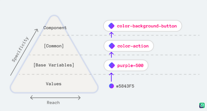
We can observe a common design principle: the lower the level of the design token, the more abstract it is; the higher the level, the more specific it is, and the closer it is to actual usage scenarios.
Explanation of Three Common Design Token Levels
Reference Token / Base Variable
This is the most foundational and abstract level of design tokens, usually directly corresponding to actual values (value), for example:
- color-red-900 👉 #FF0000
- spacing-4 👉 16px
- text-sm 👉 14px
These tokens' names are not semantic, merely abstract representations of visual attributes, commonly seen in the foundational definitions of design variables like color, spacing, and fonts.
System Token
This level adds a semantic layer on top of Reference Tokens, mapping abstract values to specific design purposes, for example:
- color-red-900 👉 color-error
- spacing-4 👉 spacing-form-padding
This way, even if the underlying values (like color codes, spacing) change, the semantic names remain consistent, and designers and engineers can more intuitively understand their actual use and design context.
Component Token
The top-level Component Tokens are bound to specific component styles, highly semantic, often used for setting component states and variants, for example:
- button-primary-background-hover
- input-error-border
This naming approach enhances style semantic clarity and consistency, especially suitable for large design systems.
CTI (Category → Type → Item)
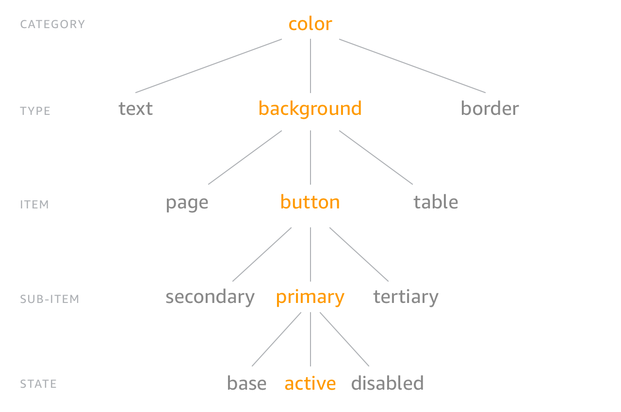
Here's an explanation of each level:
- Category: The highest level of classification, e.g., color, size, font, spacing
- Type: Describes the attributes of the category, e.g., background, text, border
- Item: Describes the element, e.g., dropdown, control, container
- Sub Item: Variants of the element, e.g., primary, secondary, success.
- Status: Describes states, e.g., hover, focus, active, disabled
This naming method helps designers and engineers quickly understand style settings and ensures consistency.
Conclusion
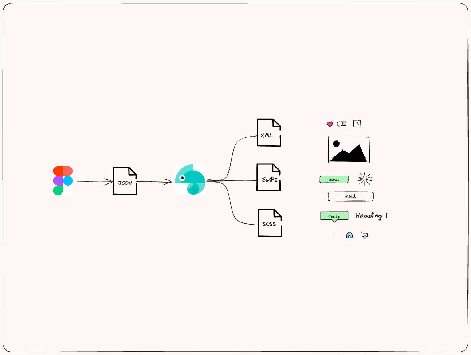
Above, we've introduced many core concepts of design tokens. The next chapters will use the practical tool Style Dictionary to implement these concepts step by step. Before diving into practice, we can glimpse the overall workflow from here
Further Reading