Writing

Dark and Light Theming

文章發表於

Dark and light themes have become almost standard features for websites in recent years, from personal blogs to global client applications (e.g., GitHub), offering users the flexibility to choose their preferred interface style.

To achieve seamless theme switching on a website, I believe the most important principle is: during development, use Design Tokens as the foundation for CSS parameters. In the previous chapter From Design Tokens to CSS, we've already discussed the benefits they bring. If product color codes are not included in Design Tokens, additional handling in the application layer's CSS is necessary, which can lead to unnecessary complications when changing colors later.

Recap

Design Tokens

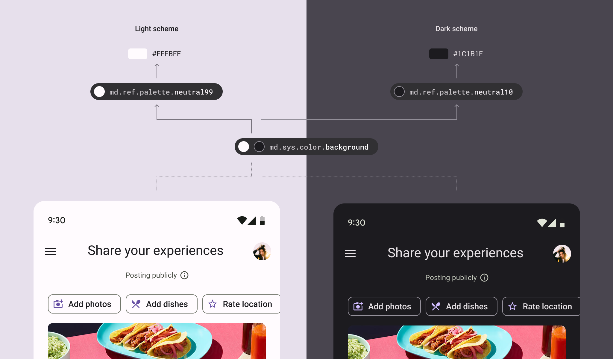
In the article Design Tokens, we introduced the basic concepts of design tokens. Among them, through the dark and light theme configuration of System Token (alias.json), which corresponds to different Reference Token (base.json), this design allows us to dynamically resolve the same System Token to different values based on different conditions.

Normalized CSS

Next, in the process of constructing design tokens with Style Dictionary, it splits the variables in :root into light and dark based on the theme and organizes them into normalized.css (Source Code). By placing this CSS file within <head>, it can be introduced when the webpage loads, and theme switching is controlled by the data-theme attribute to determine which set of theme colors to use.

The actual output structure of Style Dictionary:

/* Recommended structure - prioritize system preferences */
/* Dark theme (default) */
:root {
--your-design-system-sys-color-primary: #D0BCFF;
--your-design-system-sys-color-background: #141218;
--your-design-system-sys-color-on-background: #E6E0E9;
/* ... other dark theme tokens */
}
/* Light theme */
html[data-theme='light'], .your-design-system-light {
--your-design-system-sys-color-primary: #6750A4;
--your-design-system-sys-color-background: #FEF7FF;
--your-design-system-sys-color-on-background: #1D1B20;
/* ... other light theme tokens */
}

Below, we will introduce how to implement the functionality that allows users to switch between dark and light modes, which is the useTheme Hook to be introduced in this article.

useTheme

Description

The core functionality of useTheme is to control the value of the data-theme attribute, while providing theme state management and persistent storage capabilities.

API

Ideally, we hope that when using useTheme, it allows us to update data-theme and obtain the current theme state.

import { useTheme } from '@tocino-ui/core/hooks'
export default () => {
const { theme, resolvedTheme, toggleTheme, setTheme } = useTheme()
return (
<div>
<span>Current Theme: {theme}</span>
<span>Resolved Theme: {resolvedTheme}</span>
<button onClick={toggleTheme}>Toggle Theme</button>
<button onClick={() => setTheme('system')}>Use System Theme</button>
</div>
)
}

Parameters

NameTypeInitial ValueDescription
initialTheme'light' | 'dark' | 'system''system'Initial theme

Return API

NameTypeDescription
theme'light' | 'dark' | 'system'Current theme mode
resolvedTheme'light' | 'dark'Actually rendered theme
toggleTheme() => voidToggle between light/dark
setTheme(theme: 'light' | 'dark' | 'system') => voidSet specific theme

Implementation

Code is hidden. Click "Expand code" to view.
import React, { useEffect, useState, useCallback, useMemo } from 'react'
import { Button } from '@tocino-ui/button'

/**
 * ====== CONSTANTS ======
 */
const THEME_STORAGE_KEY = 'your-design-system-theme'
const THEME_MODES = {
  LIGHT: 'light',
  DARK: 'dark',
  SYSTEM: 'system',
}

/**
 * ====== THEME MANAGER ======
 */
const themeManager = {
  getStoredTheme: () => {
    if (typeof window === 'undefined') return THEME_MODES.SYSTEM
    
    try {
      const stored = localStorage.getItem(THEME_STORAGE_KEY)
      if (stored && Object.values(THEME_MODES).includes(stored)) {
        return stored
      }
    } catch (error) {
      console.warn('Failed to read theme setting:', error)
    }
    
    return THEME_MODES.SYSTEM
  },

  setStoredTheme: (theme) => {
    if (typeof window === 'undefined') return
    
    try {
      localStorage.setItem(THEME_STORAGE_KEY, theme)
    } catch (error) {
      console.warn('Failed to save theme setting:', error)
    }
  },

  getSystemTheme: () => {
    if (typeof window === 'undefined') return THEME_MODES.DARK
    
    return window.matchMedia('(prefers-color-scheme: dark)').matches
      ? THEME_MODES.DARK
      : THEME_MODES.LIGHT
  },

  resolveTheme: (theme) => {
    return theme === THEME_MODES.SYSTEM ? themeManager.getSystemTheme() : theme
  },

  applyTheme: (resolvedTheme) => {
    if (typeof document === 'undefined') return
    
    document.documentElement.setAttribute('data-theme', resolvedTheme)
    
    // Set color-scheme to improve the display of browser-native components
    document.documentElement.style.colorScheme = resolvedTheme
  },
}

/**
 * ====== useTheme Hook ======
 */
function useTheme(initialTheme = THEME_MODES.SYSTEM) {
  // Initialize theme state
  const [theme, setThemeState] = useState(() => {
    if (typeof window === 'undefined') return initialTheme
    return themeManager.getStoredTheme()
  })

  // Calculate the actually rendered theme
  const resolvedTheme = useMemo(() => {
    return themeManager.resolveTheme(theme)
  }, [theme])

  // Listen for system theme changes
  useEffect(() => {
    if (typeof window === 'undefined' || theme !== THEME_MODES.SYSTEM) return

    const mediaQuery = window.matchMedia('(prefers-color-scheme: dark)')
    
    const handleSystemThemeChange = () => {
      // When in system mode, force re-render to update resolvedTheme
      setThemeState(THEME_MODES.SYSTEM)
    }

    mediaQuery.addEventListener('change', handleSystemThemeChange)
    return () => mediaQuery.removeEventListener('change', handleSystemThemeChange)
  }, [theme])

  // Apply theme to DOM
  useEffect(() => {
    themeManager.applyTheme(resolvedTheme)
  }, [resolvedTheme])

  // Persist theme setting
  useEffect(() => {
    themeManager.setStoredTheme(theme)
  }, [theme])

  // Toggle theme function
  const toggleTheme = useCallback(() => {
    setThemeState(prev => {
      if (prev === THEME_MODES.SYSTEM) {
        // In system mode, determine the toggle direction based on the current system theme
        const currentSystemTheme = themeManager.getSystemTheme()
        return currentSystemTheme === THEME_MODES.DARK 
          ? THEME_MODES.LIGHT 
          : THEME_MODES.DARK
      }
      return prev === THEME_MODES.DARK ? THEME_MODES.LIGHT : THEME_MODES.DARK
    })
  }, [])

  // Set theme function
  const setTheme = useCallback((newTheme) => {
    setThemeState(newTheme)
  }, [])

  return useMemo(
    () => ({
      theme,
      resolvedTheme,
      toggleTheme,
      setTheme,
    }),
    [theme, resolvedTheme, toggleTheme, setTheme]
  )
}

/**
 * ====== Usage Example ======
 */
export default function ThemeExample() {
  const { theme, resolvedTheme, toggleTheme, setTheme } = useTheme()

  return (
    <div className="container">
      <link
        rel="stylesheet"
        href="https://cdn.jsdelivr.net/npm/@tocino-ui/design-tokens/dist/normalize/normalize.css"
      />
      
      <h2 className="header">
        Current Theme: {theme}
        {theme === 'system' && ` (resolved: ${resolvedTheme})`}
      </h2>
      
      <div className="button-group">
        <Button 
          variant={theme === 'light' ? 'filled' : 'outline'} 
          onClick={() => setTheme('light')}
        >
          Light Mode
        </Button>
        
        <Button 
          variant={theme === 'dark' ? 'filled' : 'outline'} 
          onClick={() => setTheme('dark')}
        >
          Dark Mode
        </Button>
        
        <Button 
          variant={theme === 'system' ? 'filled' : 'outline'} 
          onClick={() => setTheme('system')}
        >
          System Mode
        </Button>
      </div>
      
      <div className="info">
        <p>Try switching your operating system's theme settings to see the changes in System Mode!</p>
        <p>Theme settings are automatically saved in localStorage.</p>
      </div>
    </div>
  )
}

As seen above, we've introduced the Button component we previously worked on, and through useTheme, we control the value of data-theme, enabling the design system to support switching between dark and light themes.

If you enjoyed this article, please click the buttons below to share it with more people. Your support means a lot to me as a writer.
Buy me a coffee