A Complete Guide to Converting Design Tokens into CSS with Style Dictionary
- 文章發表於
This article will introduce the relationship between Design Tokens and CSS, and how to convert design tokens into CSS using Style Dictionary.
Why Do We Need Style Dictionary?
Before the advent of Style Dictionary, engineers across different platforms often built their own management systems to maintain the visual elements defined by design teams. For example:
- Front-end engineers might use Sass/SCSS to manage style variables
- iOS engineers might use Swift to define visual elements
- Android engineers might adopt XML resource files
However, the way colors are defined varies across platforms. For instance, iOS uses RGB decimal to define colors, while Android uses hexadecimal. This means designers must consider platform differences when defining visual elements, from top-level design tokens down to component management. Any mistake in this chain could lead to visual inconsistencies across platforms.
What Is Style Dictionary?
Style Dictionary is an open-source tool developed by Amazon. It allows you to manage design tokens and generate styling for various platforms, such as CSS, SCSS, JS, Swift, and Android.
Additionally, Style Dictionary supports customization, offering more flexibility in managing design tokens.
How to Manage Design Tokens with Style Dictionary?
Many large design teams define the visual elements needed for their design systems in Figma, such as colors, fonts, spacing, etc.
Front-end engineers can manage these visual elements as key-value pairs and use Style Dictionary to convert them into styling for different platforms.
Assuming our styling only includes color-primary:
{"color": {"red": {"100": {"type": "color","value": "#FFCDD2"},"200": {"type": "color","value": "#EF9A9A"}}}}
For the web, we can use the CLI tool to generate CSS, SCSS, or JS files, which can then be imported into projects for development.
CSS:
:root {--ui-color-red-100: #ffcdd2;--ui-color-red-200: #ef9a9a;}
JS:
export const ColorRed100 = '#ffcdd2'export const ColorRed200 = '#ef9a9a'
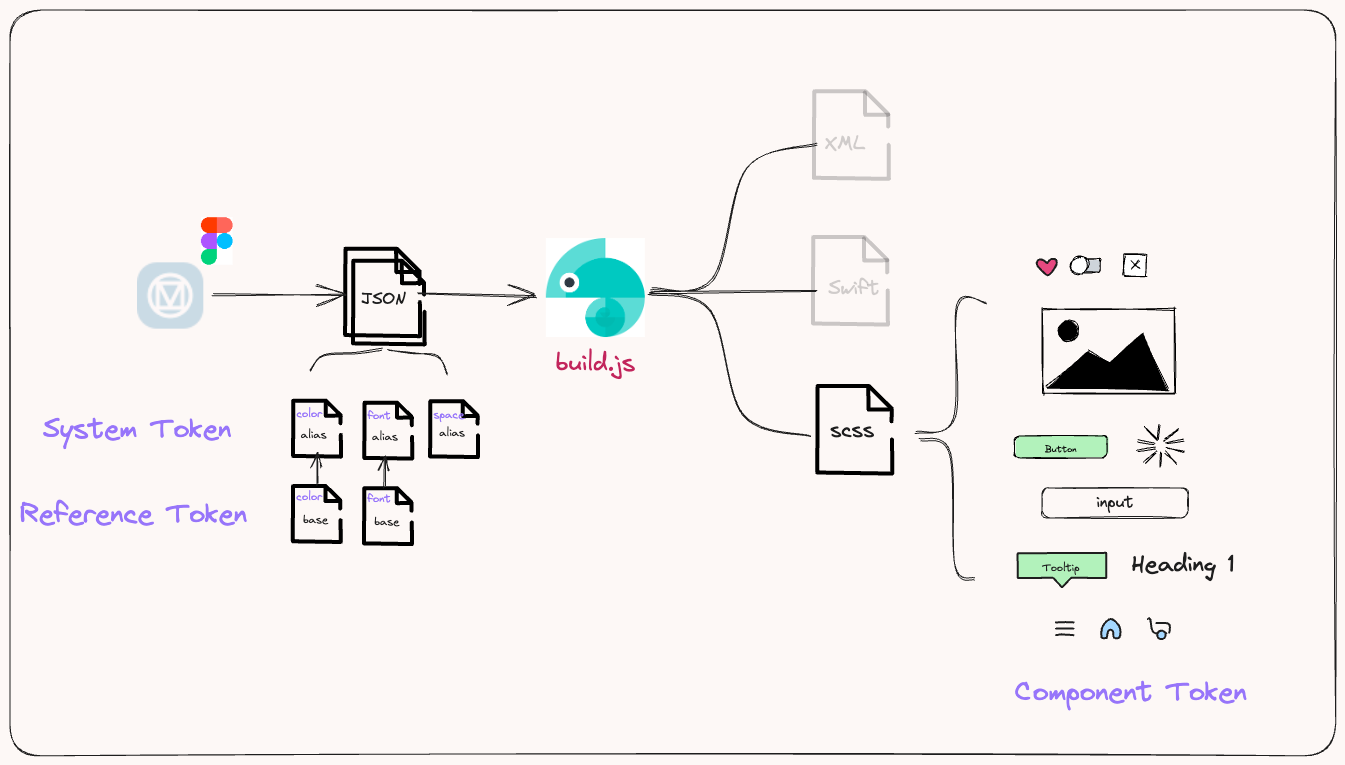
CTI (Category/Type/Item)
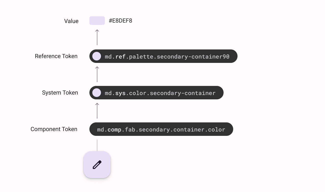
The article Design Tokens mentions that design tokens are not only top-level Reference Tokens but also include System Tokens and Component Tokens. This classification method is called CTI, which is also the recommended classification method by Style Dictionary. System Tokens and Component Tokens are defined by referencing Reference Tokens.
For example, color-primary can be defined by referencing color.red.200 and color.red.100.
{"color": {"primary": {"dark": {"value": "{color.red.200}"},"light": {"value": "{color.red.100}"}}}}
The generated CSS would look like this:
:root {--ui-color-primary-dark: #ef9a9a;--ui-color-primary-light: #ffcdd2;}
Creating Design Tokens
After understanding what Style Dictionary is and how to use it to manage visual elements, the next step is to introduce the process from design tokens to CSS.
- Create a new project named design-tokens.
- Understand the structure of visual elements; this article will use Material Design as a base.
- Convert visual elements (color, space, shadow, etc.) into key-value pair JSON files.
- Finally, use Style Dictionary to generate styling for different platforms (this article will use Web CSS as an example).
Project Directory
This article will add a design-tokens package to the existing design system. Below is the complete project structure from the first article in the series to now:
design-system/├── README.md├── package.json├── pnpm-lock.yaml└── packages/├── components/│ ├── focus-scope/│ └── visually-hidden/├── design-tokens/ # <-- New design tokens package└── tsconfig/...
Step.1 - Initialize design-tokens
Create packages.json
First, add a design-tokens folder under packages and initialize packages.json.
design-system > mkdir design-tokensdesign-system > cd design-tokensdesign-system > pnpm init
Install related packages
Install the following packages in the design-tokens project:
- style-dictionary: Core tool for managing design tokens
- sass: CSS preprocessor for more organized style development
- stylelint: CSS code quality checker
- Others: Stylelint related configuration files
pnpm add style-dictionary sass postcss stylelint stylelint-config-prettier stylelint-config-standard stylelint-config-standard-scss stylelint-order stylelint-prettier -D
Configure Stylelint
Create stylelintrc.json in the root directory of design-tokens.
design-system > touch stylelintrc.json
You can configure Stylelint according to your preferences. Here is the project's configuration file.
Step.2 - Convert visual elements into design tokens
Material Design divides design tokens into three levels: Reference Token, System Token, and Component Token.
Step.3 - Manage design tokens
Since Material Design divides tokens into three levels, the first question is to define which level of tokens should be included in the design-tokens package.
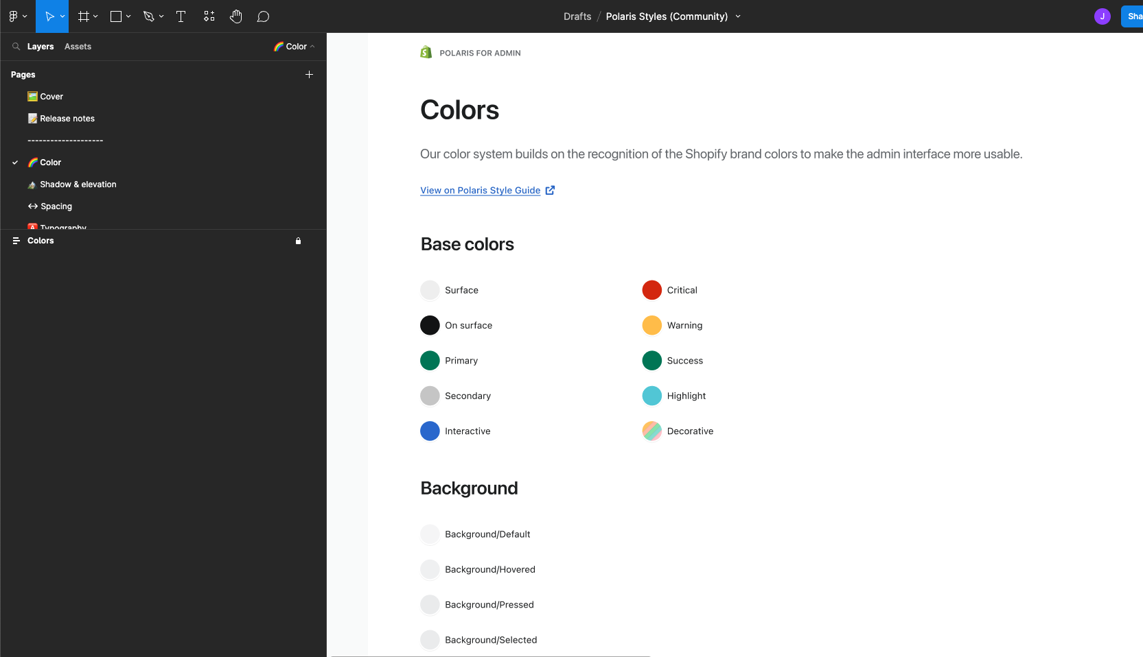
In the current architecture, we include Reference Tokens and System Tokens in design-tokens, while Component Tokens are placed in individual components. This is also the approach taken by many large design systems, such as Pinterest's Gestalt or Shopify's Polaris.
Convert visual elements into JSON
Next, convert Material Design's visual elements into key-value pairs. Here, we will use color as an example. Below is the structure of design-tokens:
design-tokens├── README.md├── package.json├── pnpm-lock.yaml├── tokens│ ├── color│ | ├── base.json <--- Reference Token│ | ├── alias.json <-- System Token...
We will store Reference Tokens and System Tokens in base.json and alias.json, respectively, with the values in alias.json referencing base.json.
This also echoes the consistency mentioned earlier. When a company wants to rebrand, it only needs to change the values of Reference Tokens without altering all levels of design tokens.
Reference Token - base.json
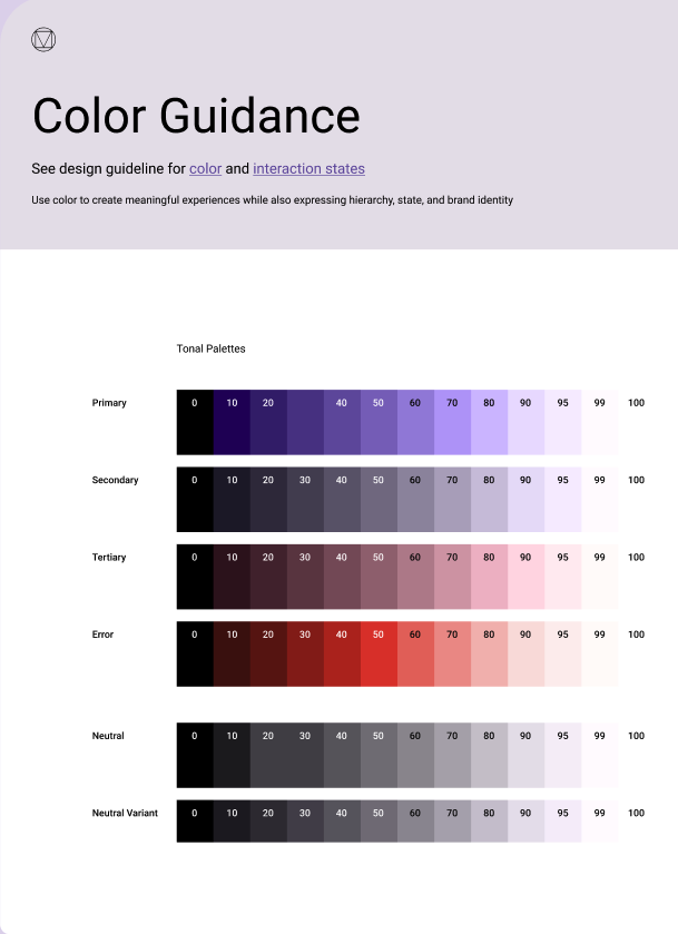
In Material Design (as shown above), all Reference Tokens are the top-level and most abstract. Converting them into tokens would look like this:
{"ref": {"palette": {"primary": {"0": { "value": "#000000" },"10": { "value": "#21005D" },..."100": { "value": "#FFFFFF" }},"secondary": {"0": { "value": "#000000" },"10": { "value": "#1D192B" },..."100": { "value": "#FFFFFF" }},}}}
System Token - alias.json
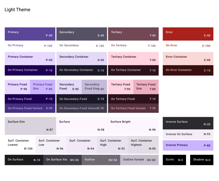
System Tokens have more explicit definitions compared to Reference Tokens. For example, --sys-color-primary-container clearly indicates that this is the primary color used for containers.
Most System Tokens have corresponding Reference Tokens. In color, this is how it looks:
{"sys": {"color": {"primary": {"light": { "value": "{ref.palette.primary.40.value}" },},"primary-container": {"light": { "value": "{ref.palette.primary.90.value}" },}}...}}
You can also define the values of System Tokens in Dark Mode:
{"sys": {"color": {"primary": {"light": { "value": "{ref.palette.primary.40.value}" },"dark": { "value": "{ref.palette.primary.80.value}" }},"primary-container": {"light": { "value": "{ref.palette.primary.90.value}" },"dark": { "value": "{ref.palette.primary.30.value}" }}}...}}
Of course, visual elements are not limited to colors; they also include fonts, spacing, etc. The concept is the same, so we won't elaborate further. You can refer to the complete setup in design-tokens.
Step.4 - Generate styling for different platforms with Style Dictionary
Finally, use Style Dictionary to generate styling for various platforms. It requires a config.js to define all build logic. Another advantage is that it can be extended with custom scripts.
Create config.js
{"source": ['./tokens/**/*.json'],"platforms": {"css": {"transformGroup": "css","buildPath": "dist/css/","files": [{"destination": "_variables.css","format": "css/variables"}]},"js": {"transformGroup": "js","buildPath": "dist/js/","files": [{"destination": "variables.js","format": "javascript/es6"}]}}}
First, source defines the files to be converted. In the example above, we place all tokens under tokens, so the setting is ./tokens/**/*.json. Next is platforms, which defines the platforms to convert to, such as CSS, JS, etc. Each platform has transformGroup and files. Refer to the Style Dictionary - Architecture documentation for more details.
Here is the project's setup:
- Extend config.json via build.js and define the corresponding
transformGroupandfiles. - After Style Dictionary converts the previously defined tokens into CSS, we can use SASS to create a CSS base and import all CSS into normalized.scss as an entry point, generating dist/normalize/normalize.css during the build.
The benefit is that basic CSS and design token CSS can be consolidated into one file. When referencing, you can directly include normalize.css. It can also be referenced in Storybook as follows:
// .storybook/preview-head.html<linkhref="https://cdn.jsdelivr.net/npm/@tocino-ui/design-tokens/dist/normalize/normalize.css"rel="stylesheet"/>
Summary
Finally, with your own Design System's normalize.css, you can include it in your projects and use Design Tokens for development!